

Description
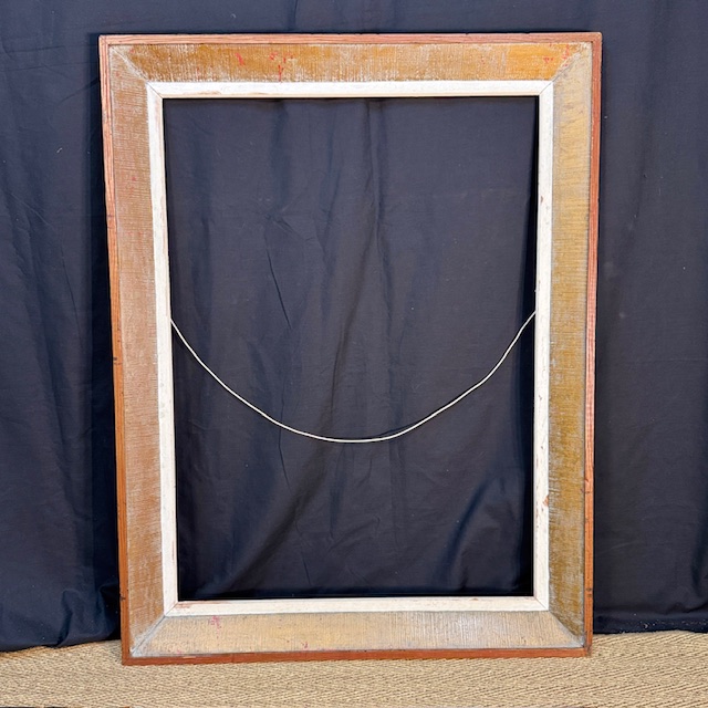
Some frames demand attention at first glance. This one reveals itself gradually.
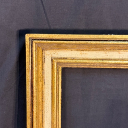
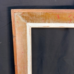
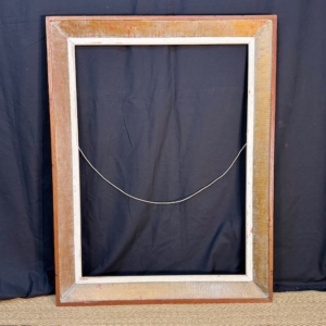
At a distance, you notice the warmth: muted terracotta and ochre tones along the outer edge, softened by time. Step closer and the surface begins to speak. The wood carries a textured finish—subtle ridges, layered paint, traces of handling. Nothing overly polished. Nothing overly restored. It retains the quiet authority of a piece that has lived in a real interior.
Inside, a softer off-white band creates a visual pause before the artwork begins. That transition—from earth tone to pale interior border—adds depth without theatricality. It is the kind of framing solution that works particularly well for works on paper: antique engravings, black-and-white photography, lithographs, or even contemporary minimalist prints.
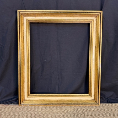
Frames with this type of textured, painterly surface became especially appealing in the mid-20th century, when materiality and surface treatment were reexamined in both art and interior design. Rather than imitating gilded opulence, they offered warmth, structure, and a certain architectural restraint.
As a vintage wooden picture frame, it does not overpower the artwork it holds. Instead, it creates a subtle dialogue between wall, image, and surrounding space. In a quiet room, it can almost function as an object in its own right—even before an image is placed inside.
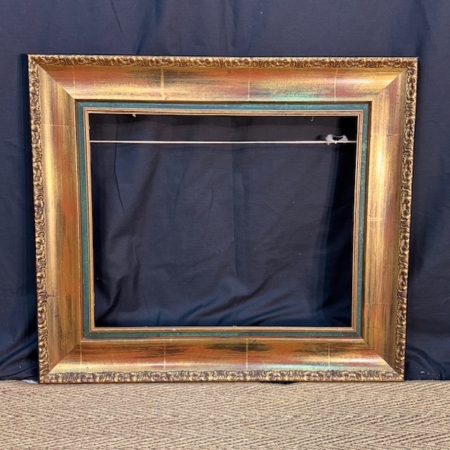
It is easy to imagine it in a study with natural light, holding a sepia-toned print. Or in a contemporary interior where texture matters as much as color. The surface, slightly irregular, catches light differently throughout the day.
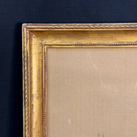
A decorative art frame, yes. But also a fragment of interior history.
This post is also available in: Spanish